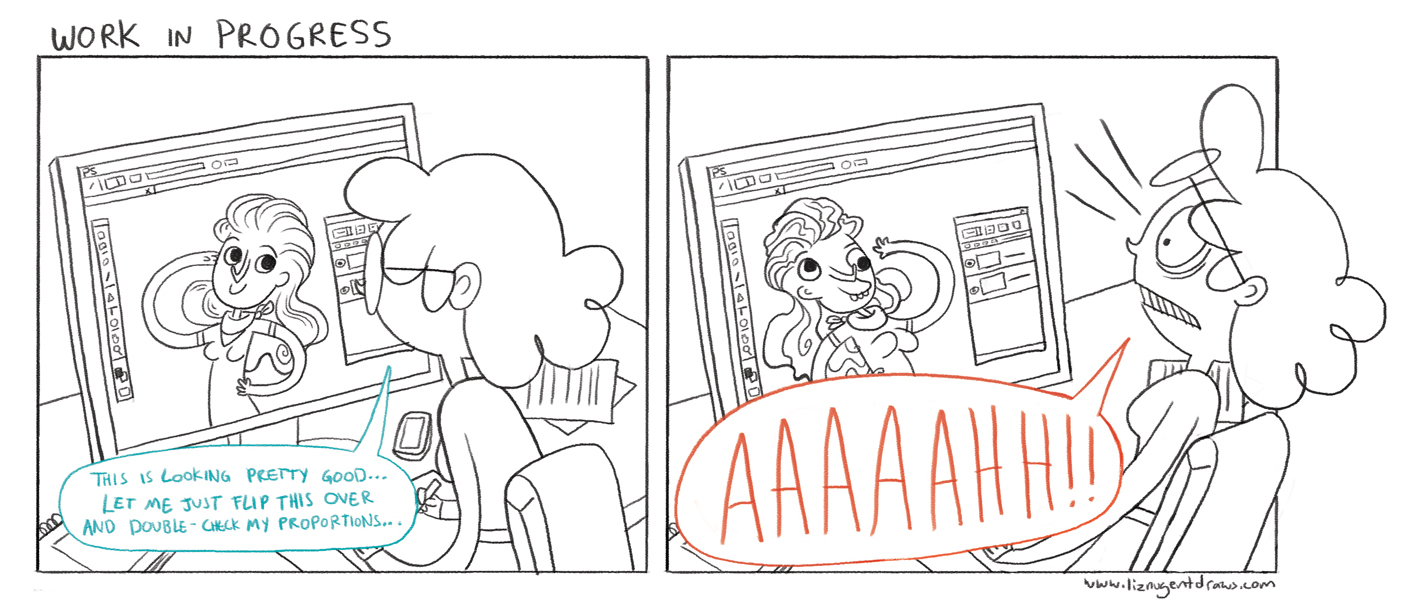
 We've all had it- you're knee deep in an illustration, deadline's coming up, and it is just not working. It's too late to scrap the whole thing, but you dread going into the studio. The piece just doesn't feel right.
What do you do?
At this point, I've hit this wall enough times that I've developed a bit of a routine to deal with it. I'd like to share my steps for troubleshooting an illustration that just isn't quite right. They're presented roughly in the order that I use them, but that's definitely dictated by my working method and artistic priorities. It could be completely different for you!
Tip 1: Check Colors
I'm a nut for color- working with color to find interesting combinations is my favorite part of any illustration. If I don't like a piece, odds are I'm not into the colors. If I feel stuck, I'll grab the hue slider and pull it around until something clicks. I might do it on one or two elements, or (temporarily!!) flatten the image and play with the whole thing. Eventually something will spark and give me a new thing to try.
Tip 2: Check Values
Because I really love color, I often neglect the importance of value - that is, light/dark - in my illustrations. If the space feels confusing or the hierarchy of elements isn't right, values are often the culprit. I check this by adding a black layer to the top of my document and setting its blending mode to "color," effectively making my image black and white. Then I can see where I need more value contrast and go in to lighten or darken certain elements. I do this with the filter still on, then turn that layer off and adjust anything that might have gotten blown out or turned a weird color.
Tip 3: Check Composition/Anatomy
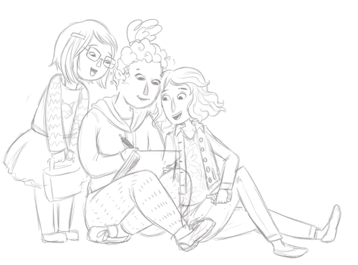
If the composition seems a little off, and particularly if a character isn't reading quite right, I flip the canvas horizontally. Be careful - don't do this unless you are READY to see all your mistakes! It will reveal many more things to fix than you want to see! This is where I'll realize a character is leaning or has a lopsided face, and I rotate/tweak/adjust as needed.
Tip 4: Check Scale
If a composition is still reading as dull to me, I take a look at scale. I'll take elements and make them waaaay bigger, or waaay smaller - MUCH more than makes sense to me. Sometimes I pull back a bit from that, other times I realize that exaggeration is exactly where I need it.
Tip 5: Show a Friend!
This is where the Circle of Trust comes in. I have a very close group of artist friends who I know can help me out of artistic jams when I need it. I'll show them and see what they think the thorny spot may be. Sometimes they think the issue is what I think it is - and sometimes they point out something else completely that ends up being the key. I've had friends completely save illustrations for me with suggestions I absolutely never would have thought up! Sometimes, the conversation sparks a third idea that completely turns the piece around, too. You can never underestimate the value of another trusted set of eyes.
Tip 6: Walk Away
When I'm really and truly stuck, I need to just take a break for a while. If possible I'll set it down for a day or two. Otherwise, a long walk, cooking some lunch, hanging out with my dog- anything to get out of my studio and thinking about something else for a while. Often, I come back with a fresh perspective on what to tweak.
Tip 7: Just Keep Going
It's hard to love a work in progress! There's a period in nearly every piece where I start to wonder if I'm any good at illustration at all, and the only way through is to just keep going. We all experience this! It'll look better when it's done, I promise. It'll be fine. You got this.
Tip 8: Fix it, Already!
If none of the above have worked.. odds are I know what the problem is, and have been in denial. There's probably an element in the illustration that just isn't drawn well. The anatomy is bad, or the expression is bland, or I didn't do enough research, or I didn't give it enough personality, or any number of things. Sooner or later, I just have to look up some reference, dig in, and redraw the damn thing. And yes- it DOES usually take me 7 steps to hit this point! Even when I've seen it sitting there all along.
I can say that without fail, after I've executed all these steps, I've always wound up with an illustration that I'm satisfied with. I'm not going to pretend I've absolutely adored everything that's ever left my desk, but I've never submitted something that I legitimately thought was a bad solution. The last thing to keep in mind is that when art is your job, you aren't going to be in love with everything you do. Clients will ask for things you don't agree with, the subject matter may not tickle you, or you might just have a bad day. It doesn't have to be The Best Thing You've Made Ever to be The Best You Can Do This Time.
And seriously. It'll be fine.
Note: Shoutout to the weekly #kidlitart chat for being the inspiration for this blog post. This originated as a series of tweets I shared during our "art triumphs/techniques" chat. Also, big thanks to Rubin Pingk for encouraging me to collect them together into a blog post!

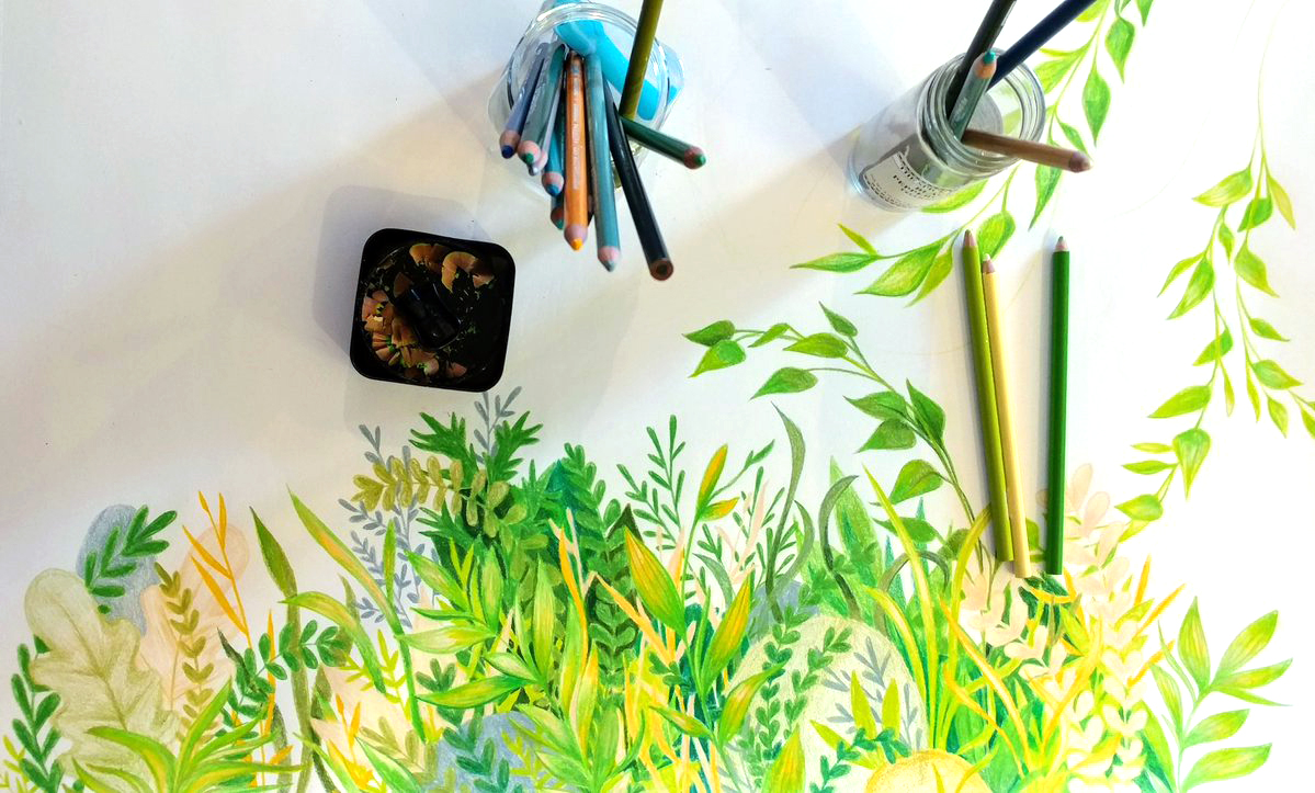
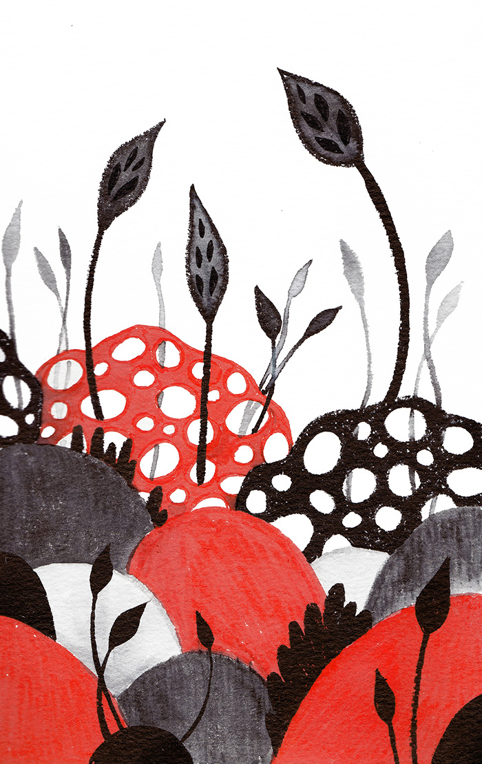
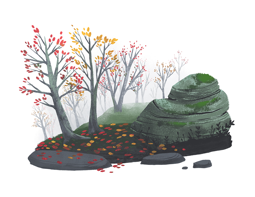
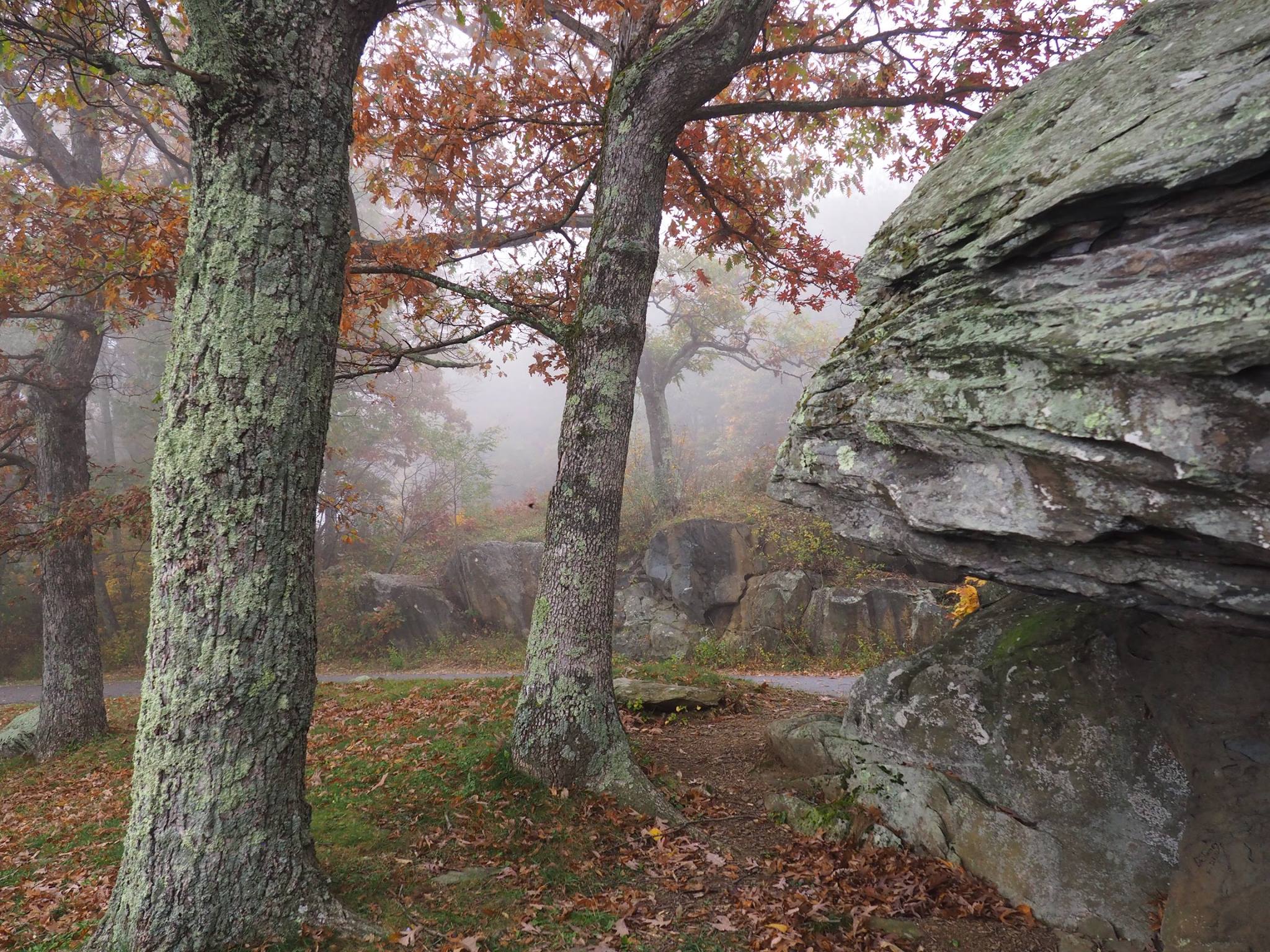
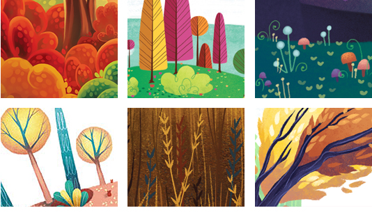
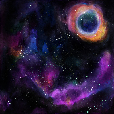
 Putting my green colored pencils through the ringer again, for another piece inspired by my local park.
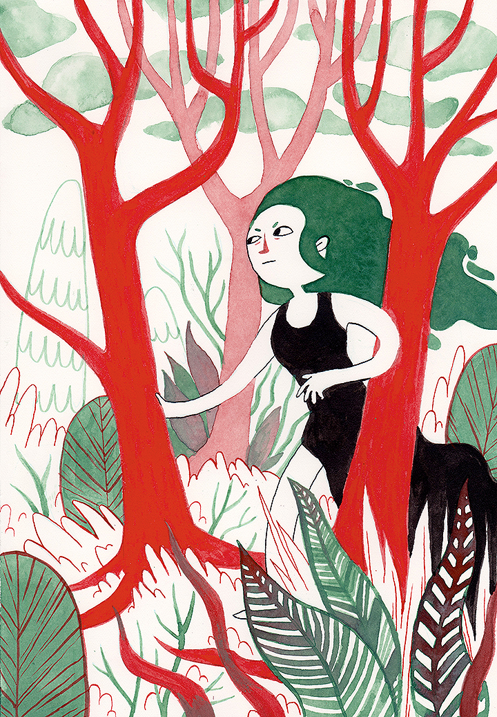
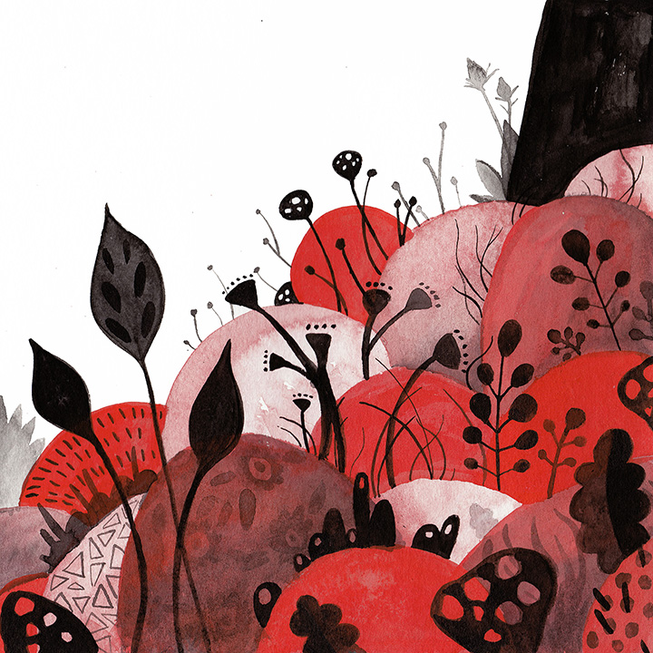
 I've been painting and drawing with ink a lot lately. I've been using a few different methods and materials - dip pen, brush, and a few different waterbrushes that I've filled with acrylic ink. Most of the red/teal you see here is from those waterbrushes- I'm finding I really like the color combination.
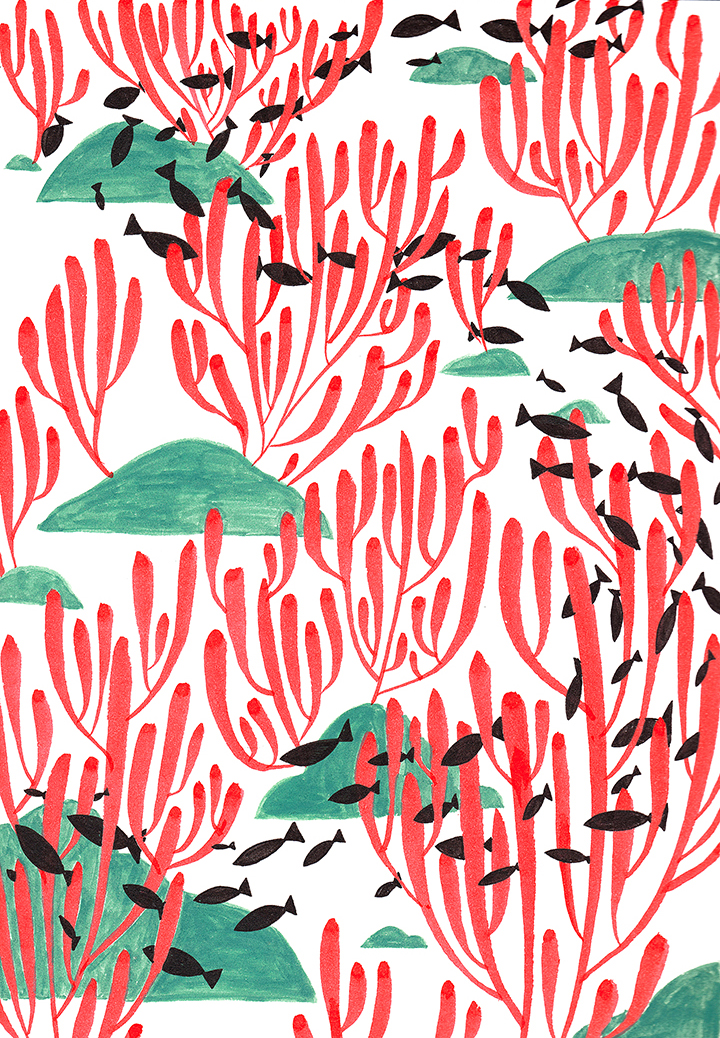
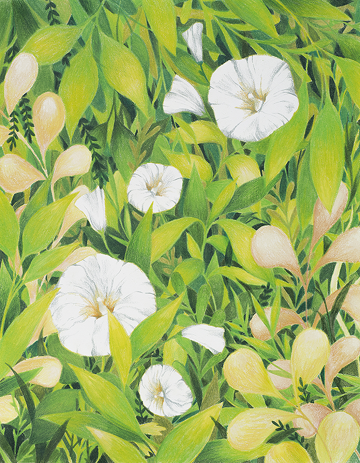
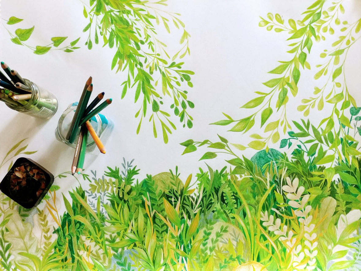
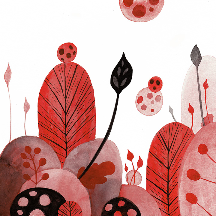
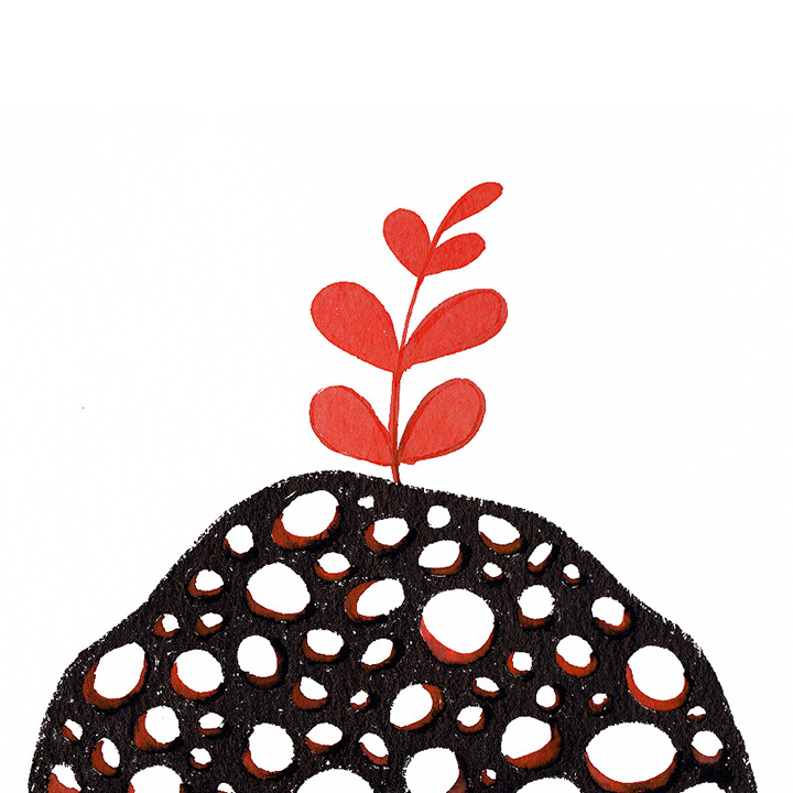
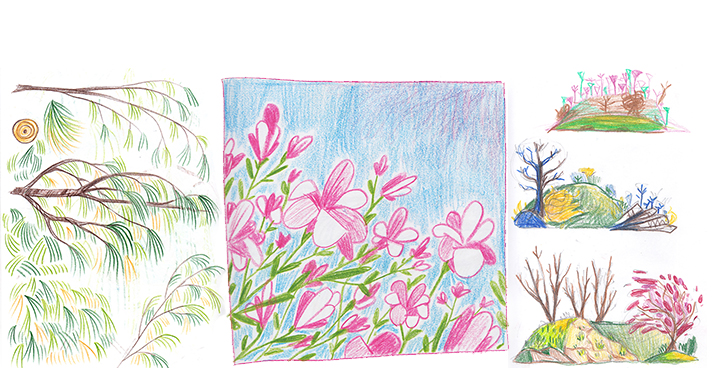
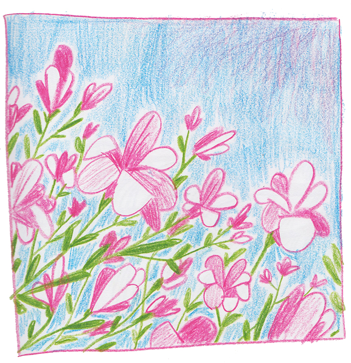
 Happy summer, everyone! I cannot get over how green it is, everywhere! Every neighborhood, roadside, and park around here just seems to be bursting with foliage and life.
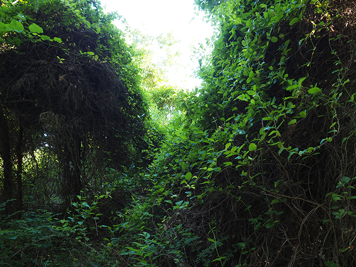
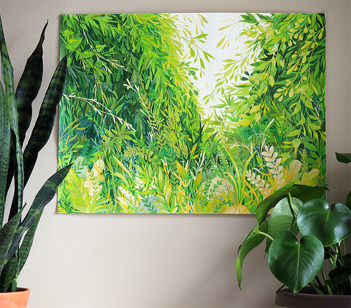
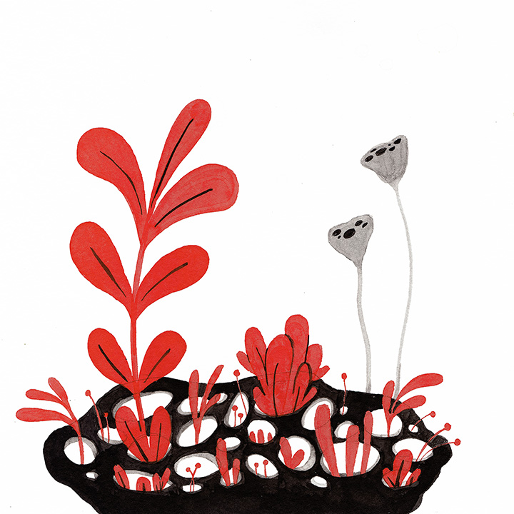
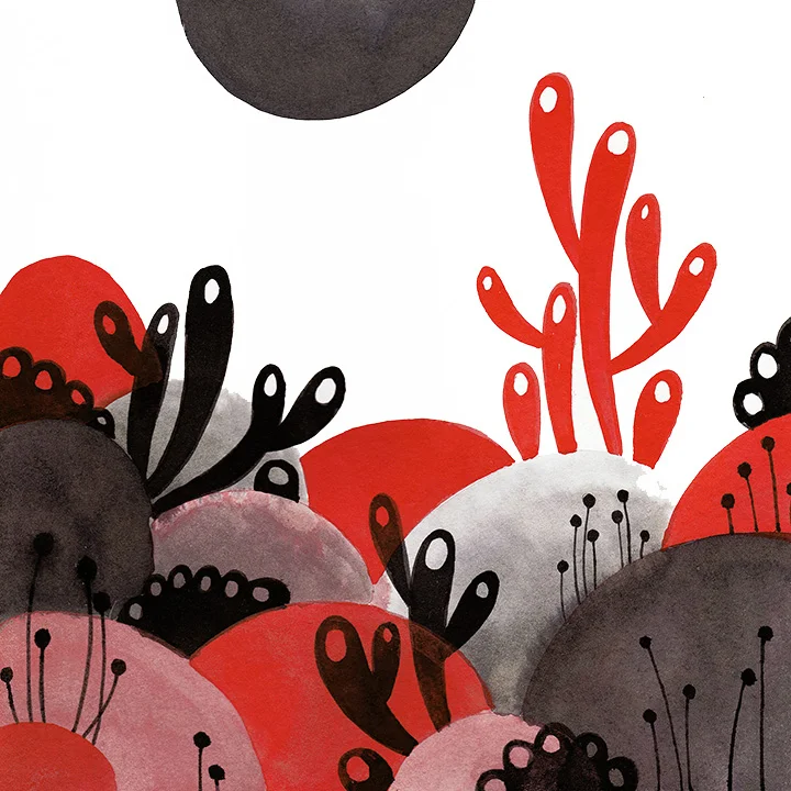
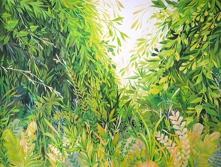 Verdant
Colored Pencil on Paper
18 x 24 inches
Verdant
Colored Pencil on Paper
18 x 24 inches


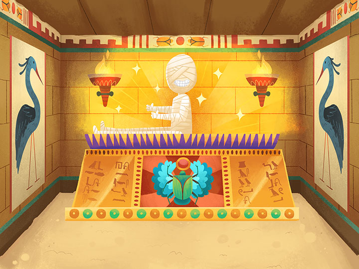
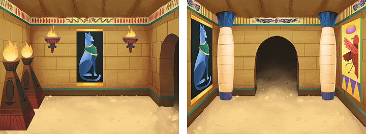
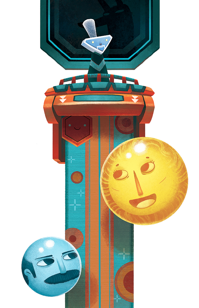
 Of course, probably the absolute coolest part of all of this is getting to see the stuff in action in a working game! My drawings move and do things!! You can see a few things in action in the trailer for the app, below. (I was collaborating with some other folks of course, so it's not all my art. My fellow MIAD Alum
 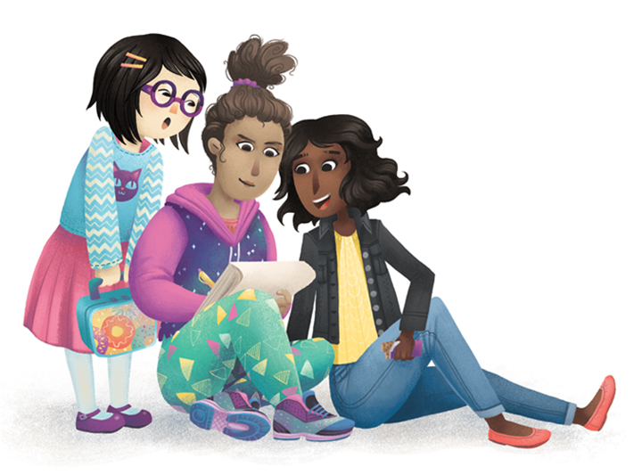 Alongside my illustration work, I also teach kids art classes a couple times a week. It's a great complement to freelance life - gets me out of the house and talking to humans, gives me a community to be a part of, and best of all, I get to spend time with my wonderful, inspiring students!
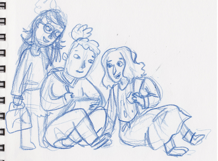

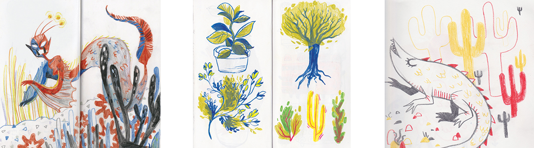
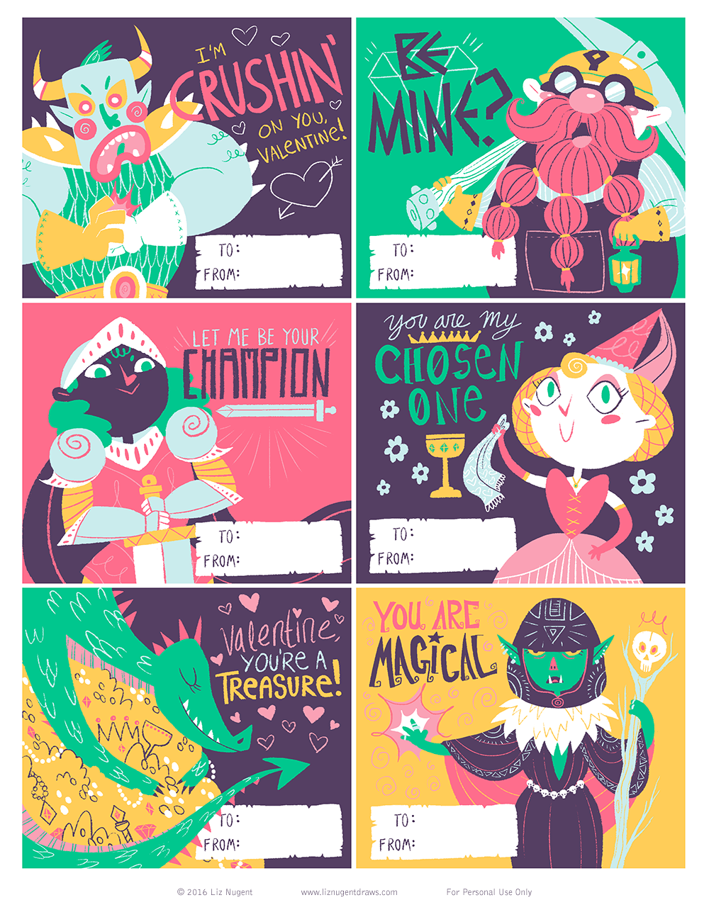
 New promo postcard illustration! Still have to draw/design the back, then I'll be ordering a big stack of these to send around.
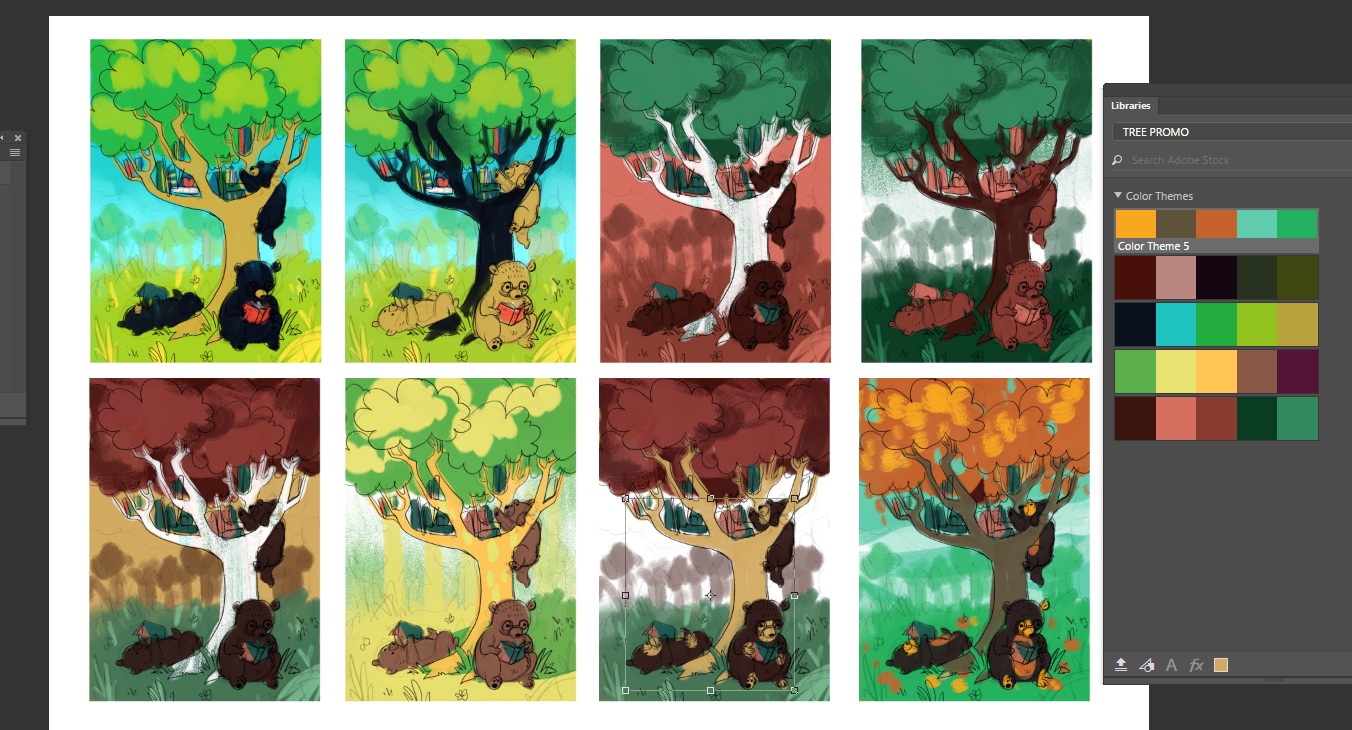
 Art is the best job.
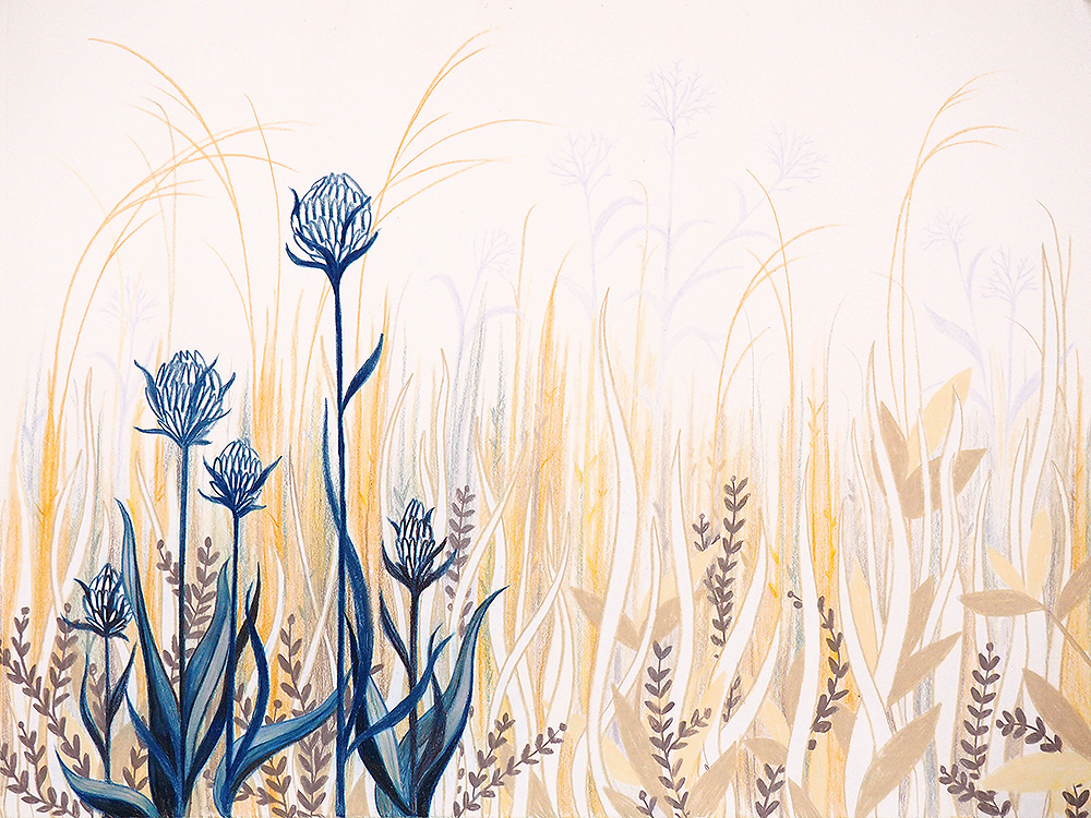 Behind my parents' house in Wisconsin is a huge empty grassy space we just called "the field." My siblings and I spent a ton of our childhood wandering around in "the fields," full of tall grass and shrubs and locusts and moths and turtles and one time, an abandoned washing machine. Later, the city added (beautiful!) drainage ponds to the fields, which brought geese, ducks, and a great blue heron. It was really a sacred, special place to me.


