
 It's really nice once in a while to get to do something totally out of your norm. Stretch out those art-brain-muscles in a new direction!
This is - of all things - an album cover commissioned by DJ (and twitter-friend) Bill Boulden. He ran a super interesting Kickstarter for his new album, Music To Die Alone In Space To. The album is being re-recorded for each backer, and they have a number of customization options, including album art.
As soon as I got the brief - a tiny, unimportant astronaut, drifting in space near a nebula - I knew I wanted to use a different process than my usual. I've now drawn space for two different picture books and I definitely didn't want to repeat myself.
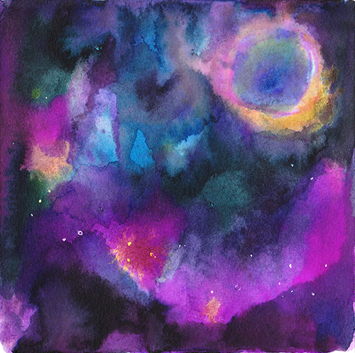
I knew from previous experiments with my inks and watercolors that I could probably get a good spacey base, and I thought that would differentiate the piece not only from my previous versions of space, but also from the 6 other covers Bill already had. So I spent an afternoon listening to his music and messing about at my drafting table:

And here's the end result, scanned but undoctored:
While I was happy with how that turned out overall, I can definitely say there was some "this looks COMPLETELY different from how it was wet" frustration. I spent some time pushing the values by painting over areas in photoshop and using a few other sundry tricks. Eventually I got to something like this:
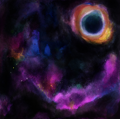
Ok, but not super spacey. No stars. I had originally planned to mask them off after my first light wash (you can see a few there), but I forgot to do them before pouring out my inks for the other washes, and I didn't want the ink to dry while I messed around with masking fluid trying to make it work. (Masking fluid and I don't get along very well yet..)
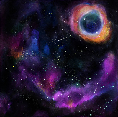
I tried playing with and making a few brushes in photoshop, but nothing really seemed right. What I was really trying to emulate was the paint-spatter effect from using a stiff brush... so finally I figured I'd just go do that. But, I needed to be able to manipulate those stars as well, so rather than spatter white onto my painting, I spattered ink onto some tracing paper laid over the painting:

And with some minor manipulation, that got me the spacey feel I was looking for.
Then, I had to add the astronaut. This is where I had a mini identity crisis. The original art description was for a tiny astronaut in the center of the image. I drew a few astronauts on paper (hoping to keep the traditional materials vibe throughout the piece) and comped them in, but it just wasn't doing it for me.

The compositions all felt weirdly unbalanced due to nebula I'd drawn in the upper right. The astronauts felt too cute, but when I tried to draw them more realistically they just felt stiff and not me. And all of them seemed way too similar to the cool album art Bill already had. I tried a few other things - all failures - and wound up just letting it sit for a few days. That was something I learned to do in art school - we all had a few pieces finished at the last minute with WEIRD decisions end up on the crit wall, not nearly as good as they could have been. Always try to finish your art a few days before it's due, so you can sit on a bit and make changes if you need to!
After thinking about this for a few days, I decided I should try to tackle the visual issues by thinking about the composition, rather than the rendering of the astronaut. If your composition is solid, the rest will follow. So how could I communicate that the astronaut is unimportant without making it tiny? Well, so I'd have to make it big - and probably cropped. I realized if I cropped it in a really strange, awkward way, that would probably help it feel like an unimportant element. I drew a few thumbnails (something I should have done in the first place!!!), got an astronaut I liked, and sketched it in.
After flatting (with white- I was originally going to go with a typical very bright/white astronaut) I thought I was on the right track but I didn't really know how to color it. I messed around with a more stylized, flat version of the coloring, but there was a weird stylistic contrast. I kept thinking to myself, "ok, but how would I solve this problem?" Finally, I hit on adjusting the contrast of the whole piece by making the astronaut lit from behind and hence very black- almost disappearing into space. And I'd achieve that with a more painterly approach to the light, something that used to pretty much define my work. It was fun to go back to that way of thinking, and I'm really proud of how it turned out:
To sum up a blog post that's gotten much, much longer than I intended.. my takeaway from this is that it's really good to tackle something unexpected from time to time. I'm also really interested to keep trying to bridge that gap between traditional and digital work. I find I get quite bored of my artwork when I use the same workflow for too long - so hopefully this route will help introduce more experimentation and play into that process.
And go check out Music To Die Alone In Space To!